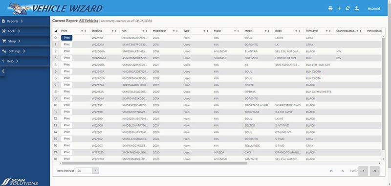


1. Redesigned Dashboard
• Intuitive Layout: The dashboard has been
redesigned for better clarity and ease of use.
Key metrics and tools are now more
accessible.
• Quick Widgets: Most commonly used widgets
added along the top tool bar making them easily
accessible.
• Print Button: Newly updated for the button itself
instead of the entire line to change colors
once printed.
• Improved Performance: Optimizations have been made to ensure faster load times and smoother interactions.
2. Enhanced Navigation Menu
• Simplified Structure: The navigation menu has been simplified for quicker access to core features and settings.
• Collapsible Sections: Users can now collapse sections of the menu to reduce clutter and focus on relevant tasks.
3. Modern Design
• Stylized Color Scheme: A fresh color palette has been introduced to create a more modern and cohesive look across the platform.
• Consistent Lettering and Fonts: Font styles and sizes have been standardized to improve readability and provide a uniform experience.
 • Updated Icons: Icons have been redesigned for a cleaner and more appealing appearance.
We hope these updates will significantly improve your experience and make using our platform more enjoyable and efficient. As always, we welcome your feedback to continue enhancing our services. Thank you for being a valued user!
